Packaging and Merchandising Design | Project 2

06/08/20 - 13/07/20 (Week 09 - Week 14)
Sia Man Sheng
0333877
Lecture Notes
Lecture 06: Merchandising
06/08/20 - week 09
Lecture Slide Done by Chew Huang Yuet & Jason
Instructions
For project 2, we had to collaborate with the School of Biosciences and to create a packaging and merchandising for their product. I teamed up with Jessica Chan for this project and our product was an instant nasi lemak specifically designed to solve the nutrition source when a flood happens.
Here's the embedded PDF for the product brief:
Figure 1: Product Brief
Below is the slide we use to present our idea in class and to the bioscience student. It included our progression from the beginning until the end of this project.
Figure 2: Ideas
Logo
We planned to develop a brand that not just limited on nasi lemak but might developed more brand extension(e.g. other flavour such as butter chicken) in the future, therefore, we use the general concept of "eat" as the brand name. "Jom Makan!" means let's go eat together in Malay.
For the personality, we want it be welcoming, engaging and makes victim feels happy when they are facing flood problems.


Mascot
As we want our product to deliver more happiness, hence we came out with the concept of mascot. Using the elements in Nasi Lemak to generate our mascot. The intention of creating this mascot is to represent nasi lemak flavour as well to make it cute so people feel happy when seeing it.


First attempt
We looked into the Samyang packaging structure is because it has a bowl-like structure, which fits our product. We want a bowl structure so it is easy to hold while eating. Also, it has enough big space for us to put in the rice and ingredients. Normal cup noodle packaging is too small to fit our product.


Second attempt


Final Outcome


We planned to develop a brand that not just limited on nasi lemak but might developed more brand extension(e.g. other flavour such as butter chicken) in the future, therefore, we use the general concept of "eat" as the brand name. "Jom Makan!" means let's go eat together in Malay.
For the personality, we want it be welcoming, engaging and makes victim feels happy when they are facing flood problems.

Figure 3: Logo ideas

Figure 4: Logo ideas
Figure 5: Logo ideas
Figure 6: Logo colour options
Figure 7: Logo colour options
Figure 8: Finalized logo (colour)
Figure 9: Finalized logo (Black)
As we want our product to deliver more happiness, hence we came out with the concept of mascot. Using the elements in Nasi Lemak to generate our mascot. The intention of creating this mascot is to represent nasi lemak flavour as well to make it cute so people feel happy when seeing it.

Figure 10: Mascot constructing progression
Figure 10: Finalized mascot
Figure 11: Finalized mascot
Figure 12: Finalized mascot
First attempt
We looked into the Samyang packaging structure is because it has a bowl-like structure, which fits our product. We want a bowl structure so it is easy to hold while eating. Also, it has enough big space for us to put in the rice and ingredients. Normal cup noodle packaging is too small to fit our product.

Figure 13: Packaging reference

Figure 14: Packaging idea sketches

Figure 14.1: Colour selection

Figure 15: Packaging design (first attempt)
Second attempt

Figure 16: Packaging design (second attempt)

Figure 17: Packaging design-top cover (second attempt)
Final Outcome

Figure 18: Mock-up

Figure 19: Mock-up

Figure 20: Mock-up

Figure 21: Packaging design(Final)

Figure 22: Packaging design- top cover (Final)
Figure 23: Packaging design (PDF)

Figure 24: Components

Figure 25: QR code will be directed to Malaysia flood official website

Figure 26: Dieline
Figure 27: Dieline (PDF)
Feedback
Week 09
The things that need to be considered in our project is compactness. Due to using airdrop during transfer. Idea 1 and 2 seems ok, but idea 1 can ignore the water bottle or maybe only use a more flexible water pack, focus on the flood. Idea 2 is good, it is environmentally friendly, and not using too much space.
Do more research on the SOP of the evacuation system of flood victims, see how the food is distributed and when. The imagery for visual is good, maybe can add in a story, to consoling victims because they are depressing. And the purpose of this packaging also can minimize the manpower when there is emergency information on it.
Keep updated using the same slide so we can see the evolution of the progression. And decide to focus on flood only or both commercial.
Week 10
The brand name of "JOM MAKAN" sounds like a restaurant and why is not from the problem statement which is flooded. But we have a strong rationale so is fine to continue. Logo 12 looks scary but maybe its because they hungry they will shiver. Can proceed with logo 7 and 8, they look interesting and compact. The rice is too round until cannot recognise. replace the exclamation mark with the rice or paddy.
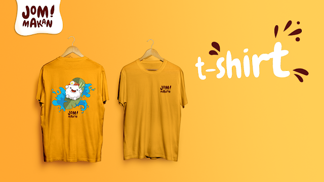
The finalized logo is good, the colour is ok as well. Can include both mascot and wordmark first, then cit can adapt for a different purpose but remove the speech bubble. It looks complicated already. For merchandise, choose 4 to work on it, fork and spoon are not under merchandise. Include the water level indicator. FOr storage box, make sure it has something provided to hold it. And also cook the amount of rice to estimate the space needed for the cooked rice.
Week 11
The brand name doesn't feel from "flood' problem statement, it sounds like a restaurant name instead. But you have a good justification, therefore, is okay as your rationale back up you. Logo 12 looks scary, it feels like hungry and shivering. Logo 7-8 maybe can go for these 2 but make the "!" using the shape of paddy or rounded rice. It looks interesting and catchy. The logo please remove the speech bubble, make sure the packaging can fit in the rice after cooking because the volume is different.
Week 14
All the symbols make them consistent in size. Overall looking good. The alignment for top cover is fine but maybe no need to show logo again on the top cover. Show QR code simulation.


Comments
Post a Comment