Advanced Typography: Project 2/The Troublemakers Manifesto Colloquium - Collateral

Advanced Typography: Project 2/The Troublemakers Manifesto Colloquium - Collateral
7/10/19 - 21/10/19 (Week 7 - Week 9)
Sia Man Sheng
0333877LECTURE NOTES
Lecture 04: Typographic Composition
07/10/19 - week 7
Static Typography
- consists of Print type and Screen type (form by square pixels)
Kinetic Typography
- It catches tension and using motion to tell a story
- Motion Kinetic Type: only involve movement but not transforming type into a new shape
- Fluid Kinetic Type: Transform type into not typographic form
- 3 main functions are:eye-catching, grab attention, deliver information effectively
Environmental Typography
- employs architectural elements such as colour, pattern, materials, images and themes.
- Basically is the interaction of type with he image
3D Typography
- There is not necessarily to consider readability in this case, it is just for a trend/ fun.
- Involved Virtual & Augmented Reality that allow users to interact with the environment.Figure 1 Original Slide on the topic "Typographic in Different Medium"
INSTRUCTION
This project is a collateral based of Project 1, we are to create 3 collateral in which poster is compulsory but the other two could be any relevant choices by inserting information provided below:
Taylor’s University
Open Public Lectures:
Lew Pik Svonn, 9AM-10AM
Ezrena Mohd., 10AM-11AM
Suzy Sulaiman, 11AM-12PM
Muthu Neduraman, 1PM–2PM
Fahmi Reza, 2PM-3PM
Fahmi Fadzil, 3PM-4PM
Lecture Theatre 12
The Troublemakers Manifesto: A Design Colloquium
November 8, 2019
Requirement
Poster (Static 50 x 70cm and Animated), Invite (interactive), TShirt, Sticker, Pin Badge, etc.Poster

Figure 2.1 Process (Poster)

Figure 2.2 First attempt (Poster)


Figure 2.3 Variation come out from first attempt (Poster)
Since the idea of breaking through is already exist in the key artwork, hence I want to enhance the concept of manifesto in the poster, which is declaration of issues/ views, be in an individual or group. And that's how I came out with the three variation/ evaluation of manifesto.

Figure 2.4 Selected Artwork (Poster)


Figure 2.5 Variation come out from second attempt (Poster)
This artwork is much more better than the other two in terms of concept representation but there is a problem in this- readability. It's readability is low due to the complexity of the background, which is a texture created using the title "troublemakers". Therefore, I have either lowered the opacity or created a gradient to make the information readable.
Figure 2.6 Final Attempt (Poster)

Figure 3.1 1st design for front (T-shirt)

Figure 3.2 2nd design for front (T-shirt)

Figure 3.3 3rd design for front (T-shirt)

Figure 3.4 1st design for back (T-shirt)

Figure 3.5 2nd design for back (T-shirt)

Figure 3.6 3rd design for back (T-shirt)

Figure 3.7 4th design for back (T-shirt)

Figure 3.8 First Attempt (T-shirt)

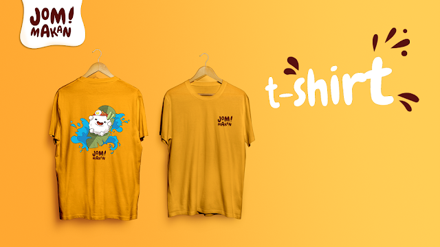
Figure 3.9 Final Attempt (T-shirt)

Figure 4.1 First Attempt (Lanyard)
Feedback: Mr. Vinod suggest me that not to put in the time for each section but "a design colloquium" is compulsory in each design. He also advice me to create one more variation to fit speaker, crew and participants.

Figure 4.2 Final Attempt (Lanyard)
Drawstring Bag

Figure 5.1 First Attempt (Drawstring Bag)

Figure 5.2 Second Attempt (Drawstring Bag)

Figure 5.3 Third Attempt (Drawstring Bag)
Overall I think my design for drawstring bag is too boring. Hence, not going to include it in my flat lay.
Final Artwork

Figure 6.1 Flat Lay
Figure 6.1.1 Flat Lay (PDF)


Figure 6.3 T-shirt

Figure 6.4 Lanyard

Figure 6.5 Microsite
Link to the website:https://larkish-stoppering.000webhostapp.com/project%202/project%202.2.html
FEEDBACK
Week 08 - 14/10/19
Personal Feedback:
Mr.Vinod said that the key artwork only can understand after I present the concept which is "breaking through" & "Think Out of the Box". Mr. Vinod advised that remove "Think out of the box", just stick on the idea of "breaking through". Regarding the Poster, I still need to manipulate the space better as there is too much empty space.
General Feedback:
Writing it down, unclear, within idea, there is categories, ideas and advertising, graphic design, conceptual art is different. advertising ideas are more strong, they have to be strong, in advertising the idea is king. In graphic design, the idea is important but not a king, the artwork match in with the idea. Graphic idea play an important role in convey the title, advertising is more pronouns, gd is not so pronouns but make sense. Books in library "beware of wet paint", please have a read, it shows how graphic design look like. Project 2 when determining it works or not , we have to differentiate. But how, we need to study. It takes experience and time. Ideas are always there.
Week 09 - 21/10/19
Personal Feedback:
For poster, Mr. Vinod ask me to choose the one with title as background texture although the readability if affected. The concept is good there but not great. Poster always avoid white background as the wall also white, hence the poster seems to disappear. For t-shirt, first back design looks interesting, might consider to put in "A Design Colloquium" into the t-shirt, same goes to every design. For lanyard, Might consider to add a black design to fit "volunteer, participants, speaker' and remove the schedule of the manifesto.
General Feedback:
Please use photoshop only to manipulate wit photos, then should be done all composition regarding type in Illustrator. The compilation for project 2 should be put together nicely with harmony. For final project, we should have absolute focus on it. There is two ways in doing it: design type to solve the problem or to enhance existing solution. We should not look at the work as a student but a professions.
Personal Feedback:
Mr.Vinod said that the key artwork only can understand after I present the concept which is "breaking through" & "Think Out of the Box". Mr. Vinod advised that remove "Think out of the box", just stick on the idea of "breaking through". Regarding the Poster, I still need to manipulate the space better as there is too much empty space.
General Feedback:
Writing it down, unclear, within idea, there is categories, ideas and advertising, graphic design, conceptual art is different. advertising ideas are more strong, they have to be strong, in advertising the idea is king. In graphic design, the idea is important but not a king, the artwork match in with the idea. Graphic idea play an important role in convey the title, advertising is more pronouns, gd is not so pronouns but make sense. Books in library "beware of wet paint", please have a read, it shows how graphic design look like. Project 2 when determining it works or not , we have to differentiate. But how, we need to study. It takes experience and time. Ideas are always there.
Week 09 - 21/10/19
Personal Feedback:
For poster, Mr. Vinod ask me to choose the one with title as background texture although the readability if affected. The concept is good there but not great. Poster always avoid white background as the wall also white, hence the poster seems to disappear. For t-shirt, first back design looks interesting, might consider to put in "A Design Colloquium" into the t-shirt, same goes to every design. For lanyard, Might consider to add a black design to fit "volunteer, participants, speaker' and remove the schedule of the manifesto.
General Feedback:
Please use photoshop only to manipulate wit photos, then should be done all composition regarding type in Illustrator. The compilation for project 2 should be put together nicely with harmony. For final project, we should have absolute focus on it. There is two ways in doing it: design type to solve the problem or to enhance existing solution. We should not look at the work as a student but a professions.
REFLECTION
Experiences:
The class is getting less patience until this stage, I think is because most of them still struggling in getting the approval on project 1 and suffering in the condition of cannot get a good concept idea. I have to keep moving as the projects are coming although I am not getting a really strong idea in project 1.
Observations:
I realized most of us are not clear how to convey the concept of "troublemakers", some of them working on such design is just because it looks nice. Without having deep understanding of troublemakers manifesto. But few of them could get the idea of troublemaker manifesto and has successfully convey the message in a strong and impulsive manner. Audience could get the idea of it immediately and visually impulsive. It is good to see that some people are good at generating strong idea but some are sensitive in colour/ composition.
Findings:
The collateral have to be different and not just a copy from the key artwork. In order to work on different collateral, I have gone through quite a lot of design and research/ principles to have the knowledge in designing t-shirt, bag and lanyard and to avoid common mistakes made by designers. It is good to have guideline for beginners but sometimes it could become the frame to limit my imagination as well. But for now, I think I still need to refers to experts' opinion and guideline to gain more experiences.
FURTHER READING

Figure 7.1 Mastering Type by Denise Bosler
Mastering Type by Denise Bosler
The grid, a matrix of vertical and horizontal lines that come together to create a two-dimensional structure, is a key element of design that allows for the systematic organization of information on a page. It is a guide to help the designer bring order to both small and large amounts of information while maintaining consistency through a design.
- Things to consider when establishing a grid:
- The grid should not be so simple that the design becomes monotonous.
- Allow the smallest images to define the size of columns, rows, and modules.
- Leave room for flexibility, especially for the headline.
- Allow for adequate white space, to help the eye flow through the content.
- Using the Rule of Halves is acceptable.
- The more information that needs to go on a page, the more flexibility is required in the grid.
- Make sure the grid reflects the connotation of the content being presented.
- A grid should work with the content, not fight it.
- A grid is merely the framework for a design. Ultimately it is the designer's abilities and sensibilities that bring the design to life.
Hierarchy
Hierarchy in layout design refers to different types of information of varying degrees of importance. It is determined by size, position, visual weight and colour. Hierarchy is so important when presenting information because wrong hierarchy, or a lack thereof, will confuse or alienate a viewer.


Comments
Post a Comment