Publishing Design - Project 1

15/04/20 - 27/05/20 (Week 1 - Week 7)
Sia Man Sheng
0333877
For project 1 we were given a task to gather content for a book of 3000 words we would be finishing by the end of the semester. The book is a continuation work done throughout the semester. The content should be around 3000 words, with minimum 3 chapters and 3-5 subtext and pullquote in each chapter.
Week 03
Individual Feedback:
Week 04
Week 05
13/05/20
Individual Feedback:
Good, it looks like reference, Mr Vinod said that Iknow what I am doing, keep it up. There is a good balance of mildness. It is fine that there are some elements with grain effect and some without, it looks balanced.
Week 06
20/05/20
Individual Feedback:
Overall is good, but pls add intensity to 3-4 more visuals. It looks too much space there which not justice to the work I have done. For the book cover, Mr Vinod suggests having a flow from front to back. Besides, consider the type of binding although we are not printing it.
Observations:
Findings:

Illustrations are a perfect go-between — able to provide the emotion and human connection of photos while distilling the imagery to a neutral flavour which can be used in a much wider range of possibilities. As art becomes more intertwined with the brands and products we build, it’s important that we have a reference point when looking for an artist. In this article, I am looking for a suitable style for general publications and for my story. I get exposed to a variety of illustration styles such as flat, granular gradient, shadow surrealism, line & shadow realism, neon fluid, semi-flat, semi-realism, palette knife, Fleisher style, mechanical realism and hyperrealism.

Layout Workbook: A Real-World Guide to Building Pages in Graphic Design by Kristin Cullen
This book provides inspiration through hundreds of well-crafted, real-life projects that have succeeded for their clients. It also teaches the fundamentals of complete and hardworking layouts. It also features all the basics of layouts, as well as dozens of mini case studies from professional studios around the globe whose layouts are proven winners. Here are some pictures of the content of the book.
LECTURE NOTES
Lecture 01: Module Briefing and Formats
15/04/20 - week 01
This week Mr.Vinod gave a brief introduction to the module and showed us examples of works and gave details on what we have to complete week by week. We then give our first task. Our Project 1 task one was to present 3000 words as the content for the book we would be designing throughout the semester. We were to complete the content by next class.
During the lecture, Mr Vinod has introduced and explained the evaluation of format applied in different civilisation such as Mesopotamian civilisation, Ancient civilisation, Indus valley civilisation, Han Chinese civilisation and European civilisation. From the evaluation, realized that every innovation of formatting is due to the technology invented and paper has been widely used all around the world after the discovered the used of wood pulp.
Lecture 1: Formats
Lecture 02: History of Print
22/04/20 - week 02
Today's lecture taught us about the history of print. Starting from the most important ingredient - the paper was invented in China. From that, the technique of rubbing has achieved and mass production became possible. The earliest printed documents were found in Korea, which text was carved into woodblocks. Next, movable type was innovated in China but achieved it's successful in Korea. FOllowing by the Guttenberg and western printing technique using alloy to carved letters has achieved in Europe that the concept has established initially in Korea using bronze.
Today's lecture taught us about the history of print. Starting from the most important ingredient - the paper was invented in China. From that, the technique of rubbing has achieved and mass production became possible. The earliest printed documents were found in Korea, which text was carved into woodblocks. Next, movable type was innovated in China but achieved it's successful in Korea. FOllowing by the Guttenberg and western printing technique using alloy to carved letters has achieved in Europe that the concept has established initially in Korea using bronze.
Lecture 2: History of Print
Lecture 03:
29/04/20 - week 03
Today's lecture has recap most of the information of what we learnt in Typography and Advanced Typography modules. All adjustment and settings to be made are due to the legibility and readability of the content. If the content is not reading friendly, readers would feel uncomfortable when reading and hence, affecting the understanding towards the content. In this class, we touched on what is the appropriate settings for line spacing, the typeface was chosen, sizing, line length, kerning, leading, ligature, paragraph spacing, alignment and sidebar.
Mr Vinod also mentioned on somethings that we should avoid. For example, We should never squeeze or compress the existing typeface, that is horrible. And we should avoid outline or add a shadow effect to the typeface. If we really want to outline it, the most we can go is lesser than 1pt size for the stroke. The reason not to do so is these settings interpreting the shape of the typeface that we normally recognised, hence lower the efficiency of understanding and readability.
Lecture 3: Typo' Redux
Today's lecture introduced us the basic information about the grid. A grid system consists of margin, text field, gutter, handling (where the heading or body text starts with), guideline, row and column. A grid does create a sense of compact planning, intelligibility and clarity. It suggests orderliness and hence the content (title, heading, subheading, body text, etc.) is able to be presented logically and clearly.
A Grid system is modular, which has flexibility for different combinations and variations with a fixed grid. But at the same time should avoid too many variations as it causes confusion. We should limit the complexity while keeping a continuity to it. If there is too less variation, then the reader will get bored.
In the end, a grid system is to achieve readability and legibility while reading it. It is about the reader experience whether they get more engagement, retention and understanding. The key is to let the pages do the talking, reader able to digest the mass amount of information visually. At the same time, beaut and elegance are also achieved.
Lecture 5: Elements
Lecture 04: The Grid
06/05/20 - week 04
Today's lecture introduced us the basic information about the grid. A grid system consists of margin, text field, gutter, handling (where the heading or body text starts with), guideline, row and column. A grid does create a sense of compact planning, intelligibility and clarity. It suggests orderliness and hence the content (title, heading, subheading, body text, etc.) is able to be presented logically and clearly.
A Grid system is modular, which has flexibility for different combinations and variations with a fixed grid. But at the same time should avoid too many variations as it causes confusion. We should limit the complexity while keeping a continuity to it. If there is too less variation, then the reader will get bored.
In the end, a grid system is to achieve readability and legibility while reading it. It is about the reader experience whether they get more engagement, retention and understanding. The key is to let the pages do the talking, reader able to digest the mass amount of information visually. At the same time, beaut and elegance are also achieved.
Lecture 4: The Grid
Lecture 05: Elements
13/05/20 - week 05
Today's lecture introduced us about the elements should be taken in consideration while designing a book, which is visual elements(picture/ imagery/ illustrations), texture elements (heading, subheading, body text, pullquote) and colour. Colour here refers to both basic shapes and as a background colour. It is because basic shapes in colour also provide the functionality to the overall design, and this consider as the function of colour.
Next when coming to the process of designing a book, first would create a grid, which able elements to shuffle around with variation created but a certain level of consistency also should be maintained. Second is select a typeface, selecting a well-functioning type family would be useful. The third is then started to creatively arrange all the elements. The exercises done before is to help with the process of this. In the end, we need to ensure that the outcome would be visually impactful, it should be strong, aggressive, unique, cannot be predictable and the engagement of reader experience.
Lecture 5: Elements
INSTRUCTIONS
Week 1: Content Generating
15/04/20
For project 1 we were given a task to gather content for a book of 3000 words we would be finishing by the end of the semester. The book is a continuation work done throughout the semester. The content should be around 3000 words, with minimum 3 chapters and 3-5 subtext and pullquote in each chapter.
Figure 1. The first attempt of content
Visual References


Progression


Diagram 1.1: Illustration done by Tom Haugomat

Diagram 1.2: Illustration done by Tom Haugomat
Progression

Diagram 2.1: More Visual References for Illustration 1

Diagram 2.2: First attempt (Illustration 1)

Diagram 2.3: Second attempt (Illustration 1)

Diagram 2.4: Illustration 1

Diagram 2.5: More Visual References for Illustration 2

Diagram 2.6: Trying on hand gesture

Diagram 2.7: First attempt (Illustration 2)

Diagram 2.8: Illustration 2

Diagram 2.9: More Visual References for Illustration 3

Diagram 2.10: Illustration 3 and trying on colours
Week 03
29/04/20

Diagram 3.1: Sketches

Diagram 3.2: Sketches

Diagram 3.3: Sketches

Diagram 3.4: Sketches

Diagram 3.5: Changing to new visual style with texture (grain effect)

Diagram 3.6: Progression for Book Cover Done in Illustrator

Diagram 3.7: Book Cover Design 1

Diagram 3.8: Book Cover Design 2

Diagram 3.9: Book Cover Design 3

Diagram 3.10: Progression for Illustration 4 Done in Illustrator

Diagram 3.11: Outcome for Illustration 4

Diagram 3.12: Progression for Illustration 5 Done in Illustrator

Diagram 3.13: Outcome for Illustration 5
Week 04
06/05/20


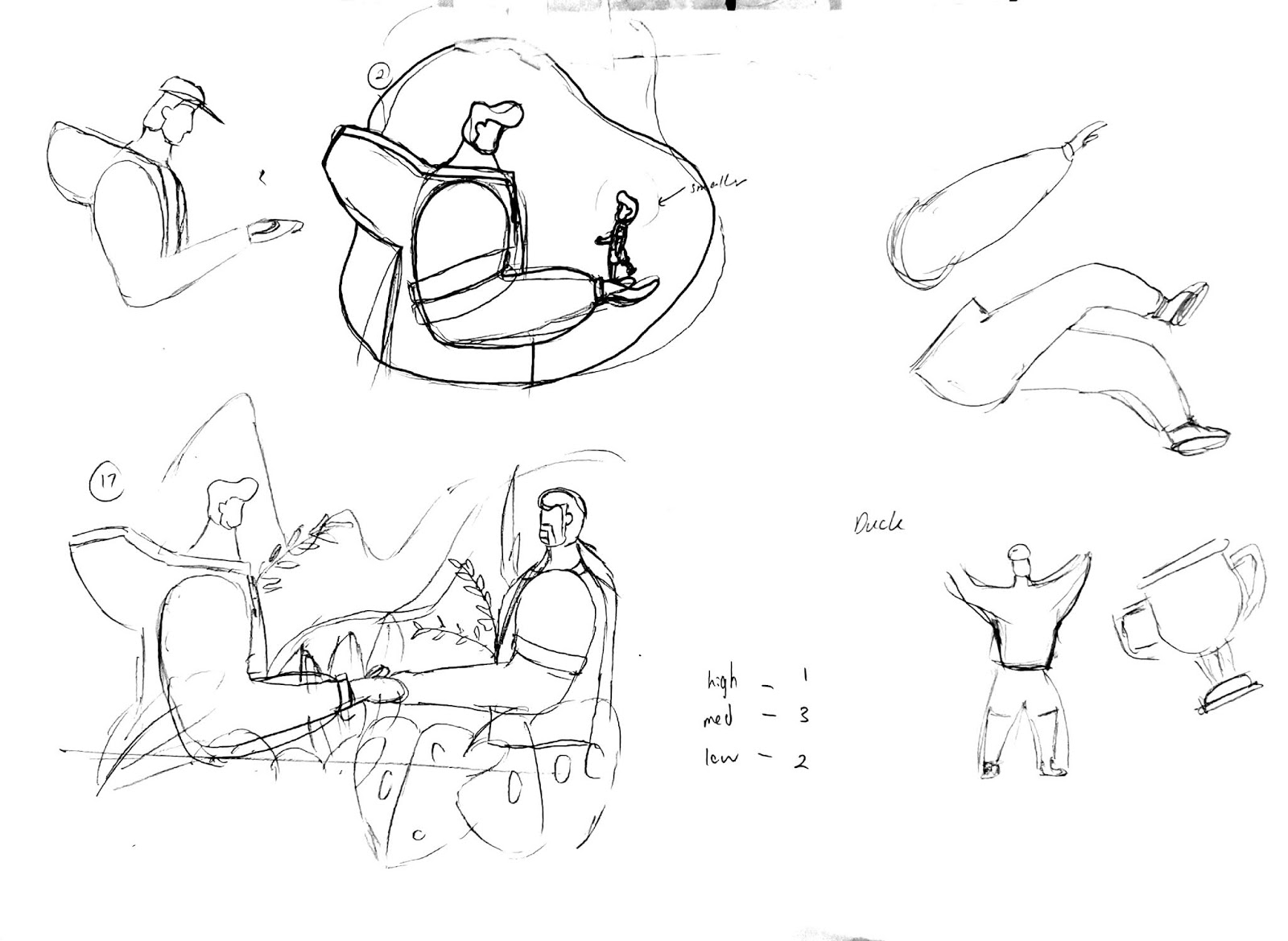
Diagram 4.0.1: Sketches

Diagram 4.1: Different Colour style

Diagram 4.2: Chosen Colour style for main characters

Diagram 4.3: Visual 1

Diagram 4.4: Visual 2

Diagram 4.5: Visual 3

Diagram 4.6: Visual 4

Diagram 4.7: Visual 5

Diagram 4.8: Visual 6
Week 05
13/05/20


Diagram 5.0.1: Sketches

Diagram 5.0.2: Sketches

Diagram 5.1: Progression (outline sketches)

Diagram 5.2: Progression (outline sketches)

Diagram 5.3: Progression (add in colour and gradient)

Diagram 5.4: Progression (add shadow and highlight)

Diagram 5.5: Visual (Second attempt)

Diagram 5.6: Visual (Second attempt)

Diagram 5.7: Visual (Second attempt)

Diagram 5.8: Visual (Second attempt)

Diagram 5.9: Visual (Second attempt)

Diagram 5.10: Visual (Second attempt)

Diagram 5.11: Visual (Second attempt)

Diagram 5.12: Visual (Second attempt)

Diagram 5.13: Visual (Second attempt)

Diagram 5.14: Visual (Second attempt)

Diagram 5.15: Visual (Second attempt)

Diagram 5.16: Visual (Second attempt)

Diagram 5.17: Visual (Second attempt)

Diagram 5.17: Visual (Second attempt)

Diagram 5.18: Visual (Second attempt)

Diagram 5.19: visual (Second attempt)
Diagram 5.20: Compilation of Visuals


Diagram 7.18: Final Visual(Pdf)
Week 06
27/05/20
According to last week comment, I have made a few adjustments, the purpose is to add more in intensity to some visual. I think I will work on it more in the following project due to time constraints.

Diagram 6.1: High-intensity level of visual

Diagram 6.2: High-intensity level of visual

Diagram 6.3: Medium-intensity level of visual

Diagram 6.4: Medium-intensity level of visual
And here would be the compilation of final version.

Diagram 7.1: Final Visual
Diagram 7.2: Final Visual
Diagram 7.3: Final Visual
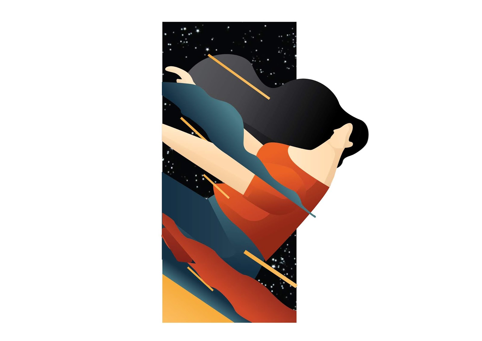
Diagram 7.4: Final Visual

Diagram 7.5: Final Visual

Diagram 7.6: Final Visual

Diagram 7.7: Final Visual

Diagram 7.8: Final Visual

Diagram 7.9: Final Visual
Diagram 7.10: Final Visual
Diagram 7.11: Final Visual

Diagram 7.12: Final Visual

Diagram 7.13: Final Visual

Diagram 7.14: Final Visual

Diagram 7.15: Final Visual

Diagram 7.16: Final Visual

Diagram 7.17: Compilation of Visuals
Diagram 7.18: Final Visual(Pdf)
FEEDBACK
Week 01
15/04/20
15/04/20
General Feedback:
Keep updating your blog. Be aware when taking pictures of your work, pictures to be placed on the blog have to be presentable, professional finished work. For project 1, please focus on completing the 3k words write up, done before next class and record all the links from now on to build your references. Besides, introduction just like the normal chapter, which including pullquote, subtext as usual.
Individual feedback:
Mr.Vinod advised me to add a cover page to the mock-up book, a thicker paper will do and make sure that I have all the 3 components updated on my blog.
Week 02
22/04/20
General Feedback:
The title "imprint" does not show in the printed book. Pullquote is the sentence, in particular, chapter that you think is important and want to emphasize it. Make sure you have done your further reading, one book per week. Please have 3 levels of intensity for the visuals. Visual must be exciting, impactful and rich in the composition.
Individual Feedback:
The good title selected, sometimes a good title can do important, awkward formatting in the content generation. The subtext is not just a definition, is more like a short paragraph to explain the word. Highlight where u want to visualize it, indicate subtext in the paragraph and underline pullquote.
Week 03
29/04/20
General Feedback:
The lecture slides should include both youtube video and lecture slides. For illustration, if you are going minimal style, the line and composition become very important as it is not as engaging and exciting as other styles. The composition does matters in all illustrations, can be varied by the point of view. Texture, points and lines also is another key point to make a good illustration.
Individual Feedback:
For illustration styles, good to go. I need to manage my time wisely as my illustrations seem like have to take a long time to produce. The colour palette always is the crucial part, it takes a long time to settle with it. I can come out with the highlights and shadow with a set of simple colour. My first colour palette seems unfinished, maybe need to look at other example or add a background colour to it.
Week 04
06/05/20
Individual Feedback:
All my work done seems to be overkill, over textured. Mr Vinod advised me to tone down 90% of the grains added. Another thing is to avoid being too similar to the reference, beware of the influences affect by it. The line weight at the back of the guy (visual 4) needs to be reduced.
13/05/20
Individual Feedback:
Good, it looks like reference, Mr Vinod said that Iknow what I am doing, keep it up. There is a good balance of mildness. It is fine that there are some elements with grain effect and some without, it looks balanced.
Week 06
20/05/20
Individual Feedback:
Overall is good, but pls add intensity to 3-4 more visuals. It looks too much space there which not justice to the work I have done. For the book cover, Mr Vinod suggests having a flow from front to back. Besides, consider the type of binding although we are not printing it.
REFLECTIONS
Experiences:
The most significant I have experienced in this project is that the originality is important, maybe not that strict in this stage but it does matter when getting into the industry. For example, my initial illustrations are having a certain level of similarity to the references. Mr Vinod has pointed it out. Afterwards, I decided to really work on my style and hence, I tried sketching my own character and make it digitally in Illustrator.
Observations:
I found that most of my coursemate are choosing a quite simple illustration style, and some times I might think about why I want to suffer myself by selecting such a complex illustration style. Especially when I notice all of they are able to done the visuals on time but I still suffering. The illustrations are actually eating up most of my time and do affect the effort I spend on other modules.
Findings:
As I have mentioned in the observation, the illustration style I have chosen actually torture me a lot. But I also get to enjoy the moment when I finished all the visuals and the outcome are eventually quite good. It has pushed me to a new level in terms of illustrating skills. What I learned and reminds me again here is when I take the challenge and able to get through it, I will able to learn more things than others, which could be one of my bonus ability in the future.
FURTHER READINGS

Article 1: https://uxdesign.cc/10-inspiring-illustration-styles-from-the-best-illustrators-of-2020-89b42f08ba81
10 Inspiring Illustration Style by Titus Decali

Further Reading 2: Layout Workbook: A Real-World Guide to Building Pages in Graphic Design by Kristin Cullen
Layout Workbook: A Real-World Guide to Building Pages in Graphic Design by Kristin Cullen
This book provides inspiration through hundreds of well-crafted, real-life projects that have succeeded for their clients. It also teaches the fundamentals of complete and hardworking layouts. It also features all the basics of layouts, as well as dozens of mini case studies from professional studios around the globe whose layouts are proven winners. Here are some pictures of the content of the book.
Comments
Post a Comment