Publishing Design- Project 2

27/05/20 - 10/06/20 (Week 7 - Week 9)
Sia Man Sheng
0333877
INSTRUCTIONS
Layout Attempt 1 | Week 7
Layout Attempt 5 | Week 9
Week 09
Observations:
Findings:

Design and Layout: Understanding and Using Graphics by David Dabner
Balance and Harmony: Combining and positioning multiple elements
This chapter talks about the rules and guidelines to follow when creating a layout with multiple elements such as images and texts.
- Engaging multiple elements: Decide on the relative importance of the elements the amount of emphasis to be placed on the image and the text. and go through the same procedure for subheadings and the text.
Symmetrical arrangement: text and image have equal engagement. Heading placed on top in the middle and thus creates quiet harmony
Asymmetrical arrangement: Less text or smaller image size creating emphasis on either one and not both elements.
Heading Dominating
Picture Dominating
Balance and Harmony: The use of the grid
The number of units within the grid system depends on the content. The more involved the content, the more versatile the content should be. A complex grid system would have different sizes of the grids and accommodate content based on the emphasis given to the content.
Week 8
Typeface: Display Typefaces
This chapter talks about the rules of choosing a display typefaces in a book.
Display type starts at 14pt; usually serves as a heading or a brief introduction to the main copy. When choosing the typeface think about the mood and feel of the content. Some typefaces are refined and gentle looking, while others are aggressive and strong. Decide if you want the display font to work with the content and work in harmony. For example, a serif type for the contrasting with a slab or sans serif type for the display.
Week 9
Text and Image: Combining
- Mood and Position: Always choose a typeface that matches the mood and type of image
Text and Images: Combining
This chapter talks about the rules and guidelines to follow when mixing text and images in a layout.
- Mood and Position: Always choose a typeface that matches the mood and type of image
INSTRUCTIONS
This project required us to utilize all the content generated in project 1 including the visuals into a publishing book. This week we started looking for references for our book layout and started working on our half-title, full title, contents, introduction and also chapter 1. Below are my references.
Layout Reference | Week 7
Fig 1: Layout Reference
Layout Attempt 1 | Week 7
From the layout references, I have developed two approaches of designs, and what I was shown to Mr Vinod is design 2 (Diagram 3).
Fig 2: Layout 1
Fig 3: Layout 2
Layout Attempt 2 | Week 7
After seeking advice from Mr Vinod, below are the adjustment made, basically is to balance the visual weight on every spread. Make the header and body text located in a consistent way.
Heading : Playfair Display, 15pt
Body text : Playfair Display, 9pt
Subtext : Playfair Display, 7pt
After seeking advice from Mr Vinod, below are the adjustment made, basically is to balance the visual weight on every spread. Make the header and body text located in a consistent way.
Heading : Playfair Display, 15pt
Body text : Playfair Display, 9pt
Subtext : Playfair Display, 7pt
Fig 4: Changes made by Mr Vinod
Layout Attempt 3 | Week 8
Fig 5: Refined Layout Attempt 1
Cover Design | Week 8


Fig 6: Cover Design
Layout Attempt 4 | Week 9
This week has done for the whole book design, also refined on visuals to has a full spread illustration on each starting of the chapter.
This week has done for the whole book design, also refined on visuals to has a full spread illustration on each starting of the chapter.
Fig 7: Refined Layout Attempt 2
Layout Attempt 5 | Week 9
Fig 8: Refined Layout Attempt 3


Fig 33: Finalized book layout with the grid(PDF)
Fig 34: Finalized book layout (PDF)

Final Attempt | Week 9
After Mr Vinod said there is too much white space in between chapter 2 and chapter 3, hence I need to introduce colour to make the visual more intense in order to break the white space.
Besides, the cover page should avoid white as it could become dirty easily, and not standing out. Therefore, adjustment made based on this comment from Mr Vinod.

Fig 9: Finalized front cover page

Fig 10: Finalized back cover page

Fig 11: Final Spread 1

Fig 12: Final Spread 2

Fig 13: Final Spread 3

Fig 14: Final Spread 4

Fig 15: Final Spread 4

Fig 16: Final Spread 6

Fig 17: Final Spread 7

Fig 18: Final Spread 8

Fig 19: Final Spread 9

Fig 20: Final Spread 10

Fig 21: Final Spread 11

Fig 22: Final Spread 12

Fig 23: Final Spread 13

Fig 24: Final Spread 14

Fig 25: Final Spread 15

Fig 26: Final Spread 16

Fig 27: Final Spread 17

Fig 28: The last page

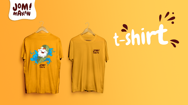
Fig 29: Mockup 1

Fig 30: Mockup 2

Fig 31: Mockup 3

Fig 32: Mockup 4
Fig 33: Finalized book layout with the grid(PDF)
Fig 34: Finalized book layout (PDF)

Fig 35: Thumbnail (JPEG)

FEEDBACK
Week 7
26/05/20
General Feedback:
Don't put the youtube video on our blog but the lecture slide instead. Please look into a layout reference, not just the layout, but also how they use their typeface used, design, the colour used.
Week 8
03/06/20
General Feedback:
Pull quote is something need to emphasize on, it is to pull people in, it no need to stay within the margin. View it as an image while considering the composition. Have variation over pages, no too predictable. Don't add colour first and add page number for the next progression.
Individual Feedback:
Mr Vinod advised me to fix the river in my body text, the rule of the heading looks weird, usually, the rule is 0.5pt except for table could have a heavier line stroke. All the openings for chapters should be the same, the illustration. My content page is not balanced as there is much more visual weight on left the left side due to the illustration.
Week 09
10/06/20
Individual Feedback: Complete and fill up the info of imprint. The transition from chapter 2 to chapter 3 seems like having a lot of white space, please introduce a neutral shape or colour to break the white space. The visual also can make it bigger to break the white space. The visual on page 21-22 is good as a cover material. For my cover, try to avoid white colour as white could become dirty easily and white is not eye-catching. Try another colour in my colour scheme, maybe red.
REFLECTIONS
Experiences:
What I realized during project 2 is I should plan roughly about the layout and the relationship with the visuals, especially when I found that afterwards only my chapter 1 has a full spread illustration. This is a silly mistake, I should think about that, that's why should think further in the beginning. If the initial planning is good enough, that would easy my task afterwards.
Observations:
I found that at this stage most of us are first time planning a book, and I feel like there is a very thick boundary limit my imagination. Then the outcome is the layout looks "ok" even though has a very interesting layout reference. This happens to me, but I think it happens to most of my coursemate as well. It can be seen that the layout are pretty similar, all the designs are quite predictable, maybe this needs more exploration on practice and reading.
Findings:
First of all, is all the typography formatting that we have kind of forget, and we are able able to pick it up again. This is a very different experience compared to when we first learnt the knowledge from previous classes. I think is because there are not much content to be format in the previous project, however, this project needed all the skills and knowledge. Therefore, I get to correct mistakes I keep doing wrong. Also due to the online classes, I get to see everyone's work closely, and the process of Mr Vinod correcting it, this is a really precious experience as we cant have this chance to observe others' work closely and the detail process of correcting it.
FURTHER READINGS

Balance and Harmony: Combining and positioning multiple elements
This chapter talks about the rules and guidelines to follow when creating a layout with multiple elements such as images and texts.
- Engaging multiple elements: Decide on the relative importance of the elements the amount of emphasis to be placed on the image and the text. and go through the same procedure for subheadings and the text.
Symmetrical arrangement: text and image have equal engagement. Heading placed on top in the middle and thus creates quiet harmony
Asymmetrical arrangement: Less text or smaller image size creating emphasis on either one and not both elements.
Heading Dominating
Picture Dominating
Balance and Harmony: The use of the grid
The number of units within the grid system depends on the content. The more involved the content, the more versatile the content should be. A complex grid system would have different sizes of the grids and accommodate content based on the emphasis given to the content.
Week 8
Typeface: Display Typefaces
This chapter talks about the rules of choosing a display typefaces in a book.
Display type starts at 14pt; usually serves as a heading or a brief introduction to the main copy. When choosing the typeface think about the mood and feel of the content. Some typefaces are refined and gentle looking, while others are aggressive and strong. Decide if you want the display font to work with the content and work in harmony. For example, a serif type for the contrasting with a slab or sans serif type for the display.
Week 9
Text and Image: Combining
- Mood and Position: Always choose a typeface that matches the mood and type of image
Text and Images: Combining
This chapter talks about the rules and guidelines to follow when mixing text and images in a layout.
- Mood and Position: Always choose a typeface that matches the mood and type of image

Comments
Post a Comment